Visual Explanation of Logistic Regression
Original published in Medium
What is Logistic Regression?
Forget about the maths. Let’s solve a problem.
A simple problem
We got a dataset, blue and red. They overlapped each other in the center.
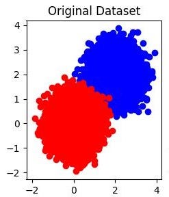
Our objective is to separate the blue and red.
Information we got – X and Y coordinate, and of course the red and blue colors.
We are going to establish an equation using X and Y coordinate to distinguish a red data point from a blue data point.
Your first instinct may be why we need to be that complicated, just cut in the middle, and objective achieved. But the computer is not as smart as you, it can just perceive the coordinates and color code.
Now, let’s deploy the logistic regression. It is like a probability model, meaning that it won’t give you a certain answer that it is red or it is blue. Afterwards, black and while are not clearly defined sometimes in reality. Instead, it will tell you that that data point is red with 80% likelihood. It absolutely makes sense actually because we have a region with mix of reds and blues. In that region, we expect a 50:50 chance; while in the outer region, we are quite certain that it is a blue.
How does it look like? From 2D to 3D.
First, I would to reconcile the 3D world to the 2D dataset that I have just shown.
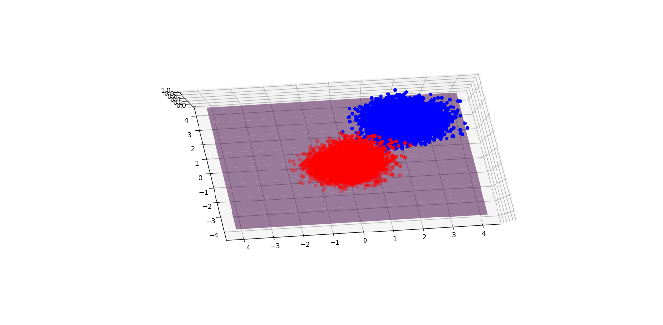
But why a 2D dataset needs to be represented in a 3D world? I am not trying to make it fancy like Interstellar, but there is a need to represent the likelihood of red and blue. We introduce the probability of blue as the height of this graph. 1 represents blue while 0 represents red. Any value between 0 and 1 will depend on the boundary you set. Say I pick 0.5 as the threshold, then 0.501 will become blue and 0.499 will become red. The purple plane presents the boundary.
A random model fails for sure. Most red points are above the plane, same as the blue points. And no matter how we move along the purple plane upwards or downwards, there is nowhere we can separate the blue and red.
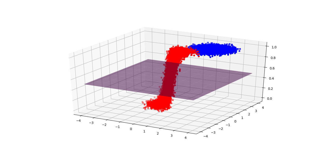
If you can move any point you want, I bet what you are going to do is to move all the red points down, and the blue points up, right?
After training, we can see that individual data point moves up or down intentionally as we expected (because we asked them to!). And now, the purple plane can easily divide the red and blue!
Generally speaking, most blue points are above the purple plane, while the red points are below it. But there are some outliers through, which we call them the classification error because the model will regard any point above the plane is blue. Life is not perfect. We can’t remove all errors no matter where we move the plane. The best we can do is to minimize the error.
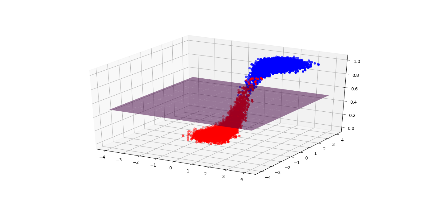
So, how does the function actually look like? Here you go!
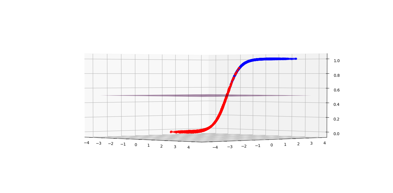
I hope you can associate this graph with the plots above. (The same graph, I just rotated it). You might notice that in the confusing region, probability is 50:50; while probabilities approach to zero or one when the inputs are towards the right or left hand side (the certain region).
Further, please note the inputs are unbounded, which means we can put whatever we want!
So what is logistic regression again?
It’s simply Logit + Regression
Inverse Logit = A magic formula that only allows a value between 0 and 1 no matter what you input
Regression = Summary of relationship between variables
What makes the zero to one boundary funny? Yes, probability shares the same range! Perhaps it is a good model for probability. Secondly, if you can recall my previous article about polarization, perhaps it is a good model for any yes and no question.
The power of the formula is to convert anything to a value between 0 and 1.
Why do we want unbounded inputs? Because the variables could be from anywhere we have no control over it. It depends on what data you have.
Eventually this model is just saying the likelihood of something given the inputs.
Final Note
The model sounds powerful right? I believe now you have more understanding of the logistic regression with all these beautiful graphs. In the next article, I will uncover the magic that why individual data point can move simultaneously such that they become separable.
Enjoy Reading This Article?
Here are some more articles you might like to read next: